The Block 2021: 5 key bathroom trends from this season
Sourced from The Sydney Morning Herald’s Domain Article
Whether it’s a tiny en suite or shared family space, the bathroom should be robust, high-functioning and a stylish space to retreat to.
We have dived into the newly renovated bathrooms on The Block. Each unique in style, these five havens will inspire your new sanctuary for a space you’ll want to linger in for longer.
Tanya and Vito’s exotic bathroom

Accented with earthy tiles and feature sinks and fixtures, Tanya and Vito’s bathroom reflects the exotic beauty of a Moroccan-style spa. Combining wood and ceramic features for warmth and stylised accessories for visual allure, they’ve achieved a luxurious master bathroom potential buyers will fall in love with.
“The handmade tiles with organic quality and finish are just beautiful,” says designer Cassandra Walker. “Instead of complicated patterns, they’ve chosen simple tiles with tonal variation for a subtly refined result.”
When drawing inspiration from a trend, be wary of being overly literal. “You don’t want your room ‘themed’, so ensure some of its elements flow through to other spaces,” she warns. “If there’s only one room in the home with rustic tiles, it could become the ‘Moroccan Room’. Your home should tell a cohesive design story.”
The Block 2021 listings are live, see them here.
Well-designed spaces impact how we connect with them, while the more nuanced details enhance the visual experience. “Thoughtful details are what create a haven,” agrees Walker. “They’ve ticked the box here, although softer aged-brass tapware would have been a nicer contrast against white.”
Ronnie and Georgia’s tiled bathroom

Bathrooms are no longer characterised by planes of hard and smooth surfaces. Tiles are being used extensively, not just for functionality but for imbuing extra dimension and style. “Mixing and matching tiles for a cohesive flow requires consideration,” Walker says. “It’s important to refine, then refine again.”
Laying tiles floor-to-ceiling draws the eye upwards, creating a feeling of openness. The floating vanity further enhances this. “I like their use of marble and tiles, too,” says Walker. “Marble is an art, and they’ve showcased it perfectly.”
Because a bathroom is hard and sleek, adding softness is essential, an effect that can be surprisingly executed with tiles. “Always include natural stone where possible,” Walker says. “You can’t go past its beauty. Marble, porcelain and natural stone with an artisanal finish or textural and tonal variation are ideal. Their choice of soft, subtle textured finger tiles is spot-on.”
Mark and Mitch’s glamour bathroom

Glamour bathrooms have worked their way out of boutique hotels and into our homes. “It’s no longer just ‘the bathroom’,” says designer Martine Cooper. “It’s now a beautiful space that’s becoming a large part of our overall living experience.”
A smaller room, like the bathroom, is ideal for taking design risks and the perfect opportunity to experiment with different elements.
“You don’t need to up-spec for a glamorous finish,” she says. “It’s not about bling. Some of the most glamorous spaces are super-subtle.”
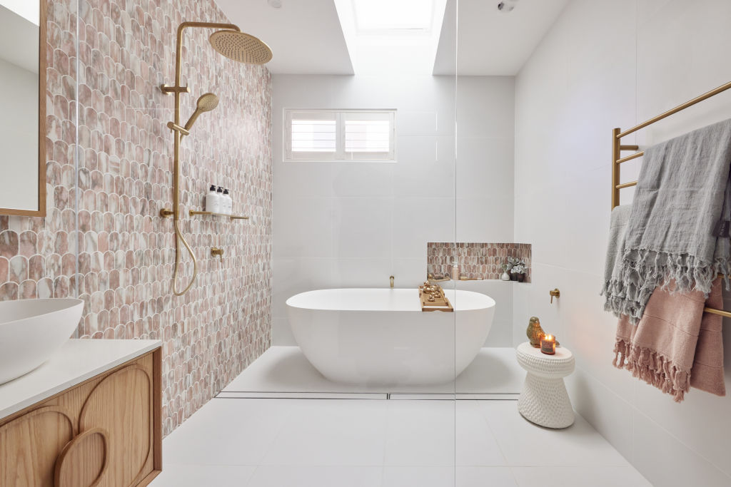
Mark and Mitch’s bathroom oozes discreet luxury, from its entire wall of rose marble tiling and matt-brass tapware to playful touches like gold bath ducks.
“Choose a beautiful hero element, like a tile or light fitting, then add supporting elements,” Cooper says. “It’s like wearing a little black dress and upstyling with accessories like jewellery and shoes.”
With our love of brass showing no signs of abating, Cooper says choosing the right finish is crucial. “Consider shiny, matt or a patina that changes colour over time,” she says. “Matt and patina are timeless and look authentic, but shiny can look tacky in a bathroom.”
Josh and Luke’s moody bathroom

A dark bathroom provides a sumptuous feel to a home. The joy of sludgy shades provides drama, moodiness and feeling of harmony. It can also feel masculine, says Cooper, who suggests including organic shapes and textures to soften edges.
“Look for finishes with movement or organic traits for interest,” she suggests. “A tile with veining or rich timber is ideal.”
Well-planned lighting is crucial, even in a space boasting ample natural light. “Light should be soft yet effective,” Cooper says. “Consider backlit mirrors, strip lighting beneath cabinetry and beautiful wall sconces.”
Kirsty and Jesse’s (almost) all-white bathroom

Adding a single colour to a white bathroom is a wise design decision for a home decorated to sell.
“Crisp white is associated with newness and feels bright and spacious,” Cooper says. “It provides potential buyers with a blank canvas, allowing them to imagine their own personalities in the space.”
The most unique aspect of Kirsty and Jesse’s room is their clever application of blue. “It feels inviting and less clinical,” she says. “Earthy organic tones paired with dulled metallics like aged brass, brushed nickel or gunmetal grey works well too.”
Colour shouldn’t be restricted to tiles and paint. Add it in the form of hardware, vanity, or basin. “Experiment with materials like terrazzo and marble with beautiful natural colour variation,” Cooper suggests. “Test your selection against your other materials and lighting, so you know it works. It’s too late to change your mind once it’s installed.”
Latest News


